Writing a résumé on a phone, measured at 390 pixels
A phone is the only computer a lot of people have. We measured all four Conxfolio tools at 390 pixels and wrote down what came back.
— a layout that fits is a measurement, not a promise.
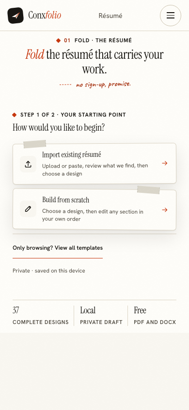
Plenty of people write a résumé on a phone because the phone is what they have. That is not a compromise to be apologised for, and a tool that treats it as one is the problem. So rather than say the résumé builder works on a phone, we measured it, and here are the numbers.
What was measured, and how
A headless Chromium was set to a 390 by 844 viewport, the width of a common phone screen. Each address was loaded until the network went quiet, then two numbers were read off the document itself: horizontal overflow, which is the document's scroll width minus the width of the window, and the number of console errors recorded during the visit. Overflow above zero means something on the page is wider than the screen and the reader has to scroll sideways to see it.
The five addresses, at 390
| Address | Horizontal overflow | Console errors |
|---|---|---|
| The home page | 0px | 0 |
| /resume-builder | 0px | 0 |
| /ats-resume-checker | 0px | 0 |
| /cover-letter-builder | 0px | 0 |
| /portfolio-builder | 0px | 0 |
Five addresses, ten numbers, all zero. That is the whole claim this page makes about fit.
The journey, not only the first screen
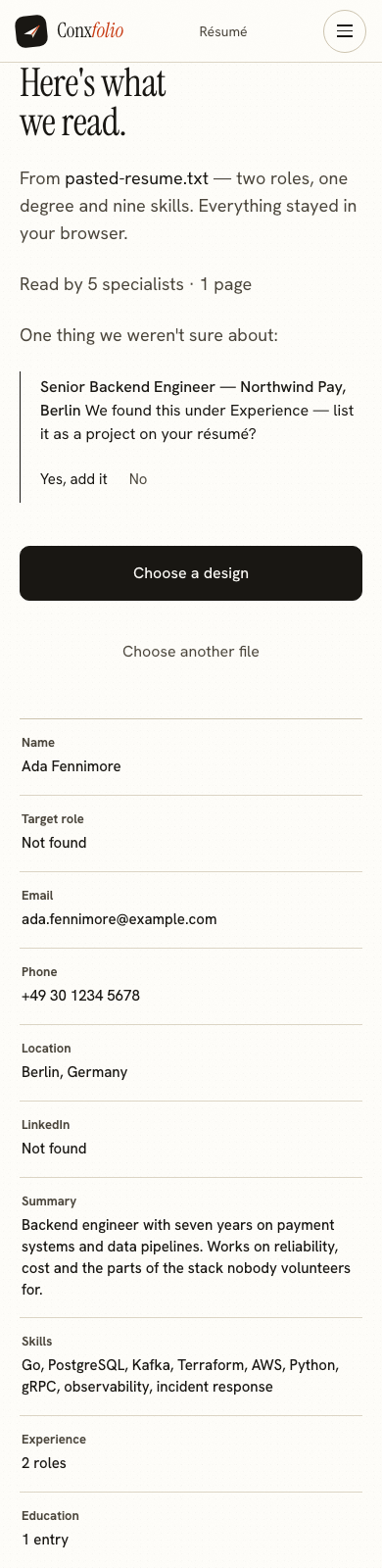
A first screen that fits proves very little, so the same phone viewport was walked through the real journey: paste a résumé, read the review, choose a design, land in the editor. The review printed "Read by 5 specialists · 1 page", which is the same line a desktop import prints. At the end of that journey the editor measured 0px of overflow and 0 console errors as well.
What a phone changes, honestly
Two things. Typing long achievement lines with a thumb is slower than typing them with ten fingers, and no layout fixes that. And the preview of the document sits below the fields rather than beside them, so you scroll between the form and the paper instead of seeing both at once. Neither changes what comes out at the end.
The export is the same document
The DOCX is assembled inside the browser on the phone, which is covered in DOCX is built in your browser. The PDF is rendered on our server and comes back as a download. In a measured export the two files arrived as Ada-Fennimore-resume.docx with no server call at all, and Ada Fennimore résumé.pdf after exactly one, a POST to the render route. A phone produces the same bytes a laptop does.
Where the work is kept
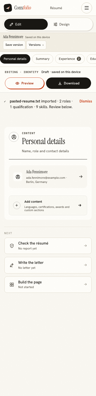
In that browser, on that phone. There is no account, which is set out in why there is no account, and the measured state after an import was 7 882 bytes in one local key. Moving it to a laptop later is its own small job, covered in moving a résumé between devices.
Checking the result on the same phone
The ATS checker measured 0px of overflow at 390 as well, so the report and its arithmetic are readable on the screen you wrote on. What that report contains is set out in how the ATS score is calculated, and the format rules it measures against are in the ATS format guide.
What to do on the phone, and what to leave
Three things are as good on a phone as anywhere. Importing an old document, because the work is pasting or picking a file. Correcting the review, because the answers are short. And running the check, because the report is a reading rather than a writing task. Two things are worse, and both are typing: the summary, and the achievement lines under each role. If a keyboard is available at any point in the week, those are the two jobs to save for it. Everything else can be finished at a bus stop, and the document is waiting in the same browser when you get to a desk, because it was written into local storage as you went rather than posted anywhere.
What this page does not claim
That a phone is the better tool. Long prose is easier on a keyboard, and if a laptop is available for an hour, use it. What is claimed is narrower and measurable: at 390 pixels nothing on these five addresses overflows, nothing errors, and the document that comes out is the same one. If your phone is older or your browser is unusual, the honest answer is that we measured one configuration and it is the one described above.
Two more places the same measurement was taken, in case your screen sits between the two: a tablet at 768 and 1024 and a Chromebook at 1366. Both came back at 0px as well. For the writing itself rather than the fitting, how to write experience bullets is the page to read on the bus.
One measurement this page deliberately does not make is speed. The figures above describe layout and errors, which are properties of the page, and say nothing about how fast the product feels on a particular handset. An older phone will render the same document more slowly, and a preview that repaints as you type is the part that will show it first. That is worth knowing before you judge the product on a five-year-old device, and it is the honest limit of what a headless measurement at a fixed viewport can tell anybody.
Open it on the phone you are holding
Import a résumé or start from scratch. Nothing to install, no account, and the export is the same document a laptop would produce.
Open the résumé builderThe iPhone walkthroughQuestions
- Is there an app to install
- No. Conxfolio is a website, so the phone browser you already have is the whole requirement. That is also why there is nothing to update and nothing that asks for permissions.
- How was the 390 measurement taken
- A headless browser was set to a 390 by 844 viewport, each address was loaded to network idle, and two numbers were read off the document: scrollWidth minus clientWidth, and the count of console errors during the visit. Both came back 0 on all five addresses.
- Can I export a PDF from a phone
- Yes. The PDF is rendered on our server and comes back as a download, exactly as it does on a laptop. The DOCX is built inside the browser itself and never leaves it.
- Does the work survive if I close the tab
- It is written into that browser as you type, so it is there when you come back on the same browser on the same phone. It goes if you clear site data.
- Is the phone layout a cut-down version
- No. The same four tools, the same 37 designs, the same export. The layout changes; the product does not.
Conxfolio is a free set of four career tools: a résumé builder with 37 rendered layouts, an ATS résumé checker that prints its own arithmetic, a cover letter builder that traces every proof paragraph back to the line it came from, and a portfolio builder with 20 authored designs. There is no account to create, nothing is held back for a paid plan, and no language model is used anywhere in the product, so the readers, the score and the letter are deterministic code you can check.