Applying from a tablet, measured at 768 and 1024
A tablet turns, which means a layout has to work twice. We measured both orientations and wrote down what came back.
— two orientations, four numbers, all of them zero.
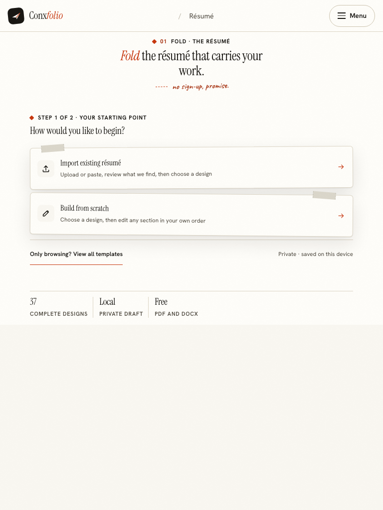
A tablet is the awkward width. It is wide enough that a phone layout looks stranded and narrow enough that a desktop layout spills. The only useful answer is a measurement, so the résumé builder and the checker were measured in both orientations.
The four measurements
| Address | Viewport | Horizontal overflow | Console errors |
|---|---|---|---|
| /resume-builder | 768 × 1024 | 0px | 0 |
| /ats-resume-checker | 768 × 1024 | 0px | 0 |
| /resume-builder | 1024 × 768 | 0px | 0 |
| /ats-resume-checker | 1024 × 768 | 0px | 0 |
Horizontal overflow is the document's scroll width minus the width of the window. Anything above zero means the reader has to push the page sideways to see part of it, which on a touch screen also fights with the gesture for going back.
What changes when the tablet turns
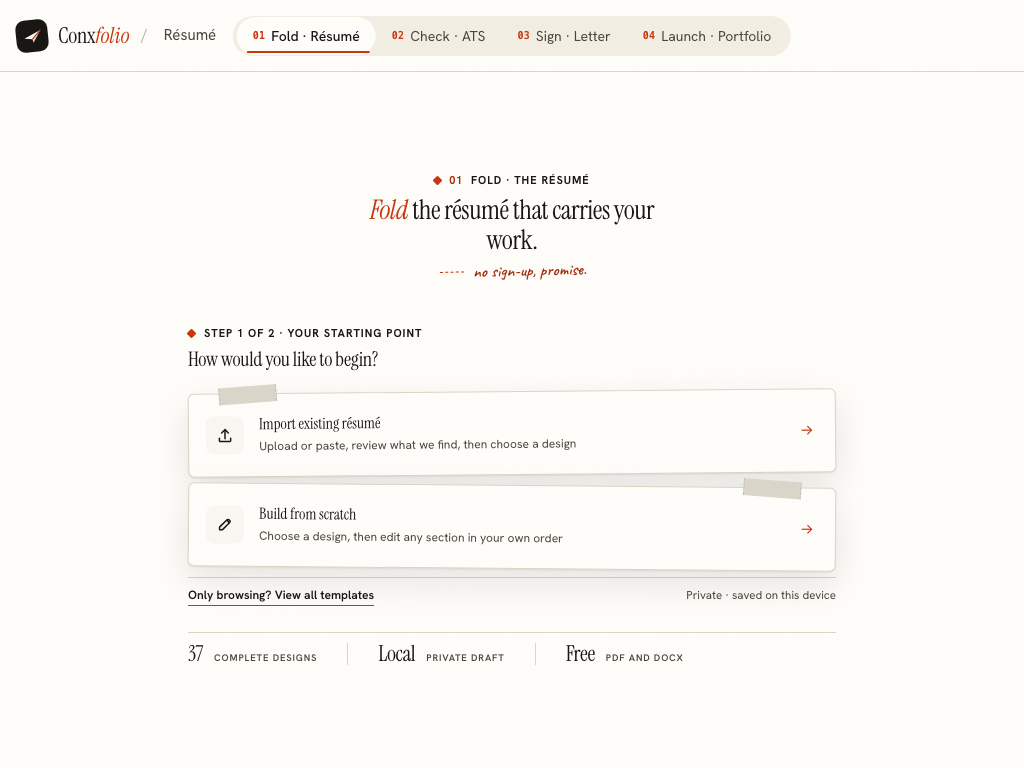
At 1024 the layout has room for two columns, so the editor keeps its section list beside the rendered document and you see both at once. In portrait the same panels stack, and you scroll between the form and the paper. Nothing is removed in either case.
The narrow end of the same layout
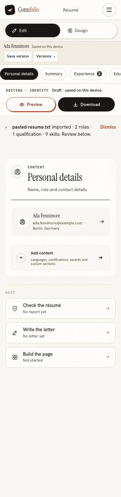
It is worth seeing where the layout ends up when it has no room at all, because a tablet in portrait is closer to that than people expect. The full set of phone measurements is in writing a résumé on a phone, and the wide end is in applying from a Chromebook.
Typing on glass
The honest constraint is the keyboard rather than the layout. Achievement lines are the slow part of a résumé and they are slower on glass. One practical order of work: get the structure and the facts in on the tablet, then write the lines properly when you have a keyboard, or dictate them and tidy up. How to write experience bullets is the page to have open while you do it.
Checking and exporting
The ATS checker measured 0px of overflow in both orientations, so the report and its arithmetic are readable without pinching. Both exports work: the DOCX is built inside the browser and the PDF is rendered on request. A measured export produced the two files after zero and one server call respectively, which is described in DOCX is built in your browser.
Where the work lives on a tablet
In that browser, on that tablet. There is no account and nothing is uploaded until you run a check, ask for a draft or export a PDF. If the tablet is shared with a household, the measured detail of what stays behind is in applying on a shared computer, and moving the work afterwards is covered in moving a résumé between devices.
Split screen, and what it does to the measurement
A tablet running two applications side by side gives the browser roughly half the width it had, so a device measured at 1024 in landscape can be rendering at 500 or less. The layout responds continuously rather than switching between two fixed designs, so it behaves like the narrow measurement rather than breaking, and the phone figures are the floor: 0px of overflow at 390. The practical consequence is about comfort rather than correctness. The editor keeps its section list beside the document only while there is room for two columns, so a split screen turns a two-column working surface into a stacked one, and the document preview moves below the form.
What this page does not claim
That every tablet behaves like the viewport we measured. Tablets vary in width, in pixel density and in browser, and a split-screen arrangement narrows the window further without changing the device. The claim is the four numbers above, taken at the two sizes named. If your tablet sits between them, the layout responds continuously rather than switching between two fixed designs, and the phone measurement is the floor.
One more thing a tablet changes, and it is the network rather than the screen. Tablets are often on mobile data, and the first load is the expensive moment: 51 requests and roughly 3 MB of uncompressed bytes, after which the work happens inside the page. The measurement and what to do about it are in low-bandwidth applications, and the accessibility of what you produce is in screen readers and résumé PDFs.
There is one tablet behaviour worth checking on your own device rather than trusting this page. A browser in desktop-site mode reports a different width to the page than the physical screen has, which produces a two-column layout squeezed into a narrow window. That is a setting rather than a fault, and it is the commonest reason a tablet looks worse than the measurements above. Turning desktop-site mode off for this address restores the layout the width deserves, and everything measured here was taken without it.
Open it on the tablet in front of you
The same four tools, the same designs, the same exports. Nothing to install and no account.
Open the résumé builderThe same test at 390Questions
- Which orientations were measured
- 768 by 1024 portrait and 1024 by 768 landscape, on the résumé builder and the ATS checker. Four measurements, all at 0px horizontal overflow with 0 console errors.
- Is there an iPad app
- No. It is a website, so the tablet's browser is the whole requirement. That also means there is nothing to update and no store account involved.
- Does an external keyboard help
- For writing achievement lines, yes, in the same way it helps anywhere. Nothing in the product depends on one.
- Can I export from a tablet
- Yes. Both exports work: the DOCX is assembled in the browser and the PDF is rendered on our server and downloaded.
- Is the tablet layout different from the desktop one
- It is the same product with a layout that responds to the width. At 1024 the editor keeps its sections beside the document; narrower than that they stack.
Conxfolio is a free set of four career tools: a résumé builder with 37 rendered layouts, an ATS résumé checker that prints its own arithmetic, a cover letter builder that traces every proof paragraph back to the line it came from, and a portfolio builder with 20 authored designs. There is no account to create, nothing is held back for a paid plan, and no language model is used anywhere in the product, so the readers, the score and the letter are deterministic code you can check.