Three typefaces, a scale and a line height, and what each one is actually for
Typographic advice for résumés is mostly superstition about fonts. The controls in front of you are narrower than that, and more useful.
— set the scale to fit the page, not to hide the gaps.
Search for résumé typography and you will be told that one typeface is professional, another is dated, and a third will have your application deleted unread. Almost none of it is testable, and none of it is what the controls in front of you actually do.
The design mode in the résumé builder offers four controls. Here is what each of them changes.
The panel
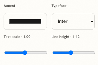
Above it sits the sentence that governs the lot: it adjusts the selected design without changing the structure of your content. Most of the typography of your page was decided when you chose the design, and these four controls tune it.
Typeface: three, and the difference between them
Inter is a neutral sans. It sets a compact page, it stays legible at small sizes, and it is the right default for a document that will be skimmed. Georgia is a serif with generous proportions; it reads slower, which suits an executive summary or an academic page where someone is expected to actually read the paragraphs. The monospace is a genuine statement, appropriate for engineering applications where the reader is used to it and misjudged anywhere else.
Text scale: the page-fitting control
The scale runs from 0.86 to 1.16 in steps of 0.02, over the whole document at once. Its real job is fitting: a résumé that spills four lines onto a second page usually fits at 0.94 without the reader noticing anything. Going below about 0.9 is the point where you are hiding a length problem rather than solving it, and the honest fix at that point is to cut a role.
The two sliders interact, which is the part most advice misses. Dropping the text scale to fit a page makes the leading proportionally tighter as well, so a page that fits at 0.92 can end up denser than intended. The repair is to put a little of the line height back, around 1.5, which buys the page air without buying back the lines you just saved.
Line height: air between the lines
From 1.2 to 1.7, starting at 1.42. Below roughly 1.3, a dense page stops offering the eye anywhere to rest, and a recruiter scanning for six seconds finds nothing to land on. Above about 1.6 a short document starts to look like a short document that knows it. Leading is the cheapest way to change how much work a page looks like, and it costs no content at all.
What none of these controls do
They do not change your sections, your entries or a single word. They do not improve the score, because the ATS checker reads text and evidence rather than appearance, and the one place layout does matter is reading order, which is a property of the design rather than of the typeface, as described in what ATS-safe means on a design.
What each export carries
The PDF carries the design as rendered: the typeface, the scale, the leading and the accent, laid out by the renderer exactly as the preview showed them. It is the file to send when the page should arrive looking the way you left it.
The DOCX carries the text, a serif or a sans, and the accent colour, in an editable Word file assembled in your browser without a single network request, which we measured in your DOCX is built in your browser. It will not reproduce the rendered layout, and it is not meant to: its job is to stay editable somewhere else. So a typographic decision made here is fully carried by one export and partly carried by the other, which is worth knowing before an agency asks for the Word version of a page you spent an evening setting.
An order of operations
Choose the design for its hierarchy. Set the typeface for the audience. Move the scale until the page ends where you want it to end. Adjust the line height last, once the content is final, because it is the control that changes most for the least. Then leave it alone: the colour question is separate and smaller than people think, and it is in colour on a résumé, while the length question is in white space and the second page.
Set the voice of your document
Open the design mode, choose a typeface and move the scale until the page fits. The structure of your content does not change.
Open the résumé builderRead about white spaceQuestions
- Which typefaces can I choose
- Three: Inter, Georgia and a monospace. Each design also carries its own typographic system, and the choice here sets the document's voice within that.
- What range does the text scale cover
- From 0.86 to 1.16, in steps of 0.02, starting at 1.00. It is a proportional scale over the whole document rather than a font size for one element.
- What about line height
- From 1.2 to 1.7, in steps of 0.05, starting at 1.42. Below about 1.3 a dense page starts to feel airless; above 1.6 a short one starts to look padded.
- Does the typeface affect an ATS
- Not directly. What affects extraction is whether the text is text, and how the columns are arranged. A serif is not harder to parse than a sans.
- Does the DOCX export keep my typeface
- It carries a serif or a sans into the Word file along with the accent colour. The PDF export carries the design as rendered.
Conxfolio is a free set of four career tools: a résumé builder with 37 rendered layouts, an ATS résumé checker that prints its own arithmetic, a cover letter builder that traces every proof paragraph back to the line it came from, and a portfolio builder with 20 authored designs. There is no account to create, nothing is held back for a paid plan, and no language model is used anywhere in the product, so the readers, the score and the letter are deterministic code you can check.