No parser reads your accent colour, so the question is only about the person
The usual advice is that colour is risky because software cannot handle it. The scoring rules say otherwise, and so does the design gallery.
— one accent, used three times, is a system; two is a decoration.
The received wisdom is that colour on a résumé is a risk because applicant tracking systems choke on it. It is worth checking that against a set of rules you can read, so we did: the scoring engine behind the ATS checker has no colour rule anywhere in it.
What the parseability rules actually penalise
Five things, all structural. A detected table or multi-column pattern, because it scrambles reading order. Standard sections with no readable content beneath them. Decorative characters, the stars and arrows people use as bullets. Unreadable glyphs in the extracted text layer, which is a broken export rather than a design choice. And shortened or mixed date formats. Colour appears in none of them, because a text layer has no colour in it to read.
So the question is about the human
Which makes it a smaller and more answerable question. An accent has one job: to tell the eye where the structure is. Section headings, a rule under the name, a header band. Used once, consistently, it makes a page faster to scan. Used four times in four places it makes a page slower, because every emphasis is competing with the others.
The control, and what the designs already decided
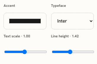
The accent sits at the top of the formatting panel in design mode. It sets one colour; where that colour lands is the design's decision, which is why the same value looks like a hairline rule in one layout and a filled header band in another. Each of the 37 designs ships with its own accent already chosen, and most of them are dark: deep reds, inks, forest greens, navy. That is the useful default. A near-black accent with one saturated element reads as deliberate, and a saturated page reads as a template.
Three practical constraints
Keep the body text near-black; an accent belongs on structure rather than on sentences. Keep contrast high enough to survive a bad monitor and a greyscale printer, which means testing the page with the accent imagined as grey. And keep to one accent: the moment a résumé has two, the reader has to work out what the second one means, and it usually means nothing.
Where colour is doing the wrong job
When it is compensating. A page with three bullet points and a bold gradient header is telling you something about the content, and the checker will say the same thing in points, because evidence carries 40 per cent of the score and appearance carries none of it. If the honest reaction to your own page is that it looks empty, colour will not fill it.
The accents the designs already carry
Every one of the 37 designs ships with an accent chosen for it, and the pattern across the set is instructive: deep crimson, ink, forest green, a dark navy, a burgundy, a muted teal. There is almost no bright colour in the whole catalogue, and the designs that do lift the saturation put it on a small element rather than on a band.
That is a reasonable default to inherit. If you change it, change it to another dark version of a colour you actually like, and check the page again at a glance rather than at reading distance. The fastest test is to look away for a second and look back: whatever the eye finds first is what the accent is doing, and it should be the structure of the page rather than a decorative rule near the margin.
The sector question
Conservative sectors are conservative about paper as well as about everything else, and a serif with an ink-black accent is never a mistake in law, finance or the public sector. Design, marketing and the creative end of product are the opposite: an entirely grey page there is itself a statement, and not the one you want. The designs are grouped into families precisely so this choice can be made by looking, as described in the paper is the product, and the typographic half of the same decision is in typography on a résumé.
Set one accent and stop
The accent control sits at the top of the formatting panel. The design decides where the colour goes; you decide what it is.
Open the résumé builderRead about typographyQuestions
- Will colour hurt my ATS score
- Not in this checker, which has no colour rule of any kind. Its parseability deductions are for multi-column reading order, missing section content, decorative characters, broken glyphs and inconsistent dates.
- What does the accent control change
- One colour, applied by the design wherever that design uses an accent: rules, headings, a header band or a sidebar, depending on the layout.
- Does the accent survive export
- Yes in both. The PDF carries the design as rendered, and the DOCX export carries the accent into the Word file along with the typeface family.
- Is a black-and-white résumé safer
- It is never wrong. Colour is an advantage only where the reader is a person and the design uses it structurally, and it is a liability where it is doing the job of content.
- What about printing
- Assume it will be printed in greyscale at some point, and check that the page still has a hierarchy when the accent becomes grey. A design that depends on colour for structure fails that test.
Conxfolio is a free set of four career tools: a résumé builder with 37 rendered layouts, an ATS résumé checker that prints its own arithmetic, a cover letter builder that traces every proof paragraph back to the line it came from, and a portfolio builder with 20 authored designs. There is no account to create, nothing is held back for a paid plan, and no language model is used anywhere in the product, so the readers, the score and the letter are deterministic code you can check.