A thumbnail of a letter tells you nothing, so the gallery shows the page
A cover letter is one page of prose. Any preview small enough to fit a grid has removed the only thing you were choosing between.
— you are choosing a page, so look at a page.
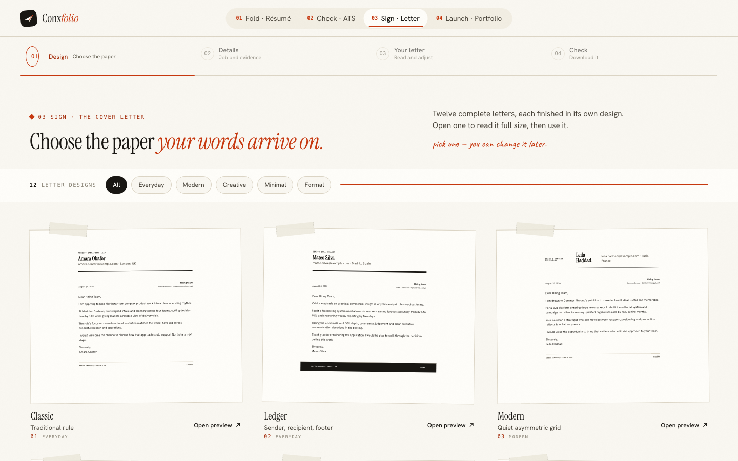
Template galleries are usually a grid of postage stamps. You choose between twelve grey rectangles, click one, and find out what you chose after your own words are already inside it. For a résumé that is annoying. For a cover letter, where the entire design is the arrangement of one page of prose, it is close to useless.
So the gallery behind the cover letter builder renders whole letters.
What is on the page
12 designs, each card carrying a complete letter: a sender block, a date, a recipient, a salutation, three paragraphs of real prose, a sign-off and a footer. They are legible in the grid without opening anything, and opening one fills the screen with the same letter at full size.
The people in them do not exist
Every name, company and role in the gallery is invented for the gallery, and each design carries a different one so the cards do not read as one letter repeated. None of them is a real person, none of them is a customer, and none of them got hired, because there is nobody to hire. A sample letter's job is to show you how a paragraph sits on a page.
Five families, and what they are for
The filter across the top groups the 12 into 5 families: everyday, modern, creative, minimal and formal. The everyday designs are the ones to reach for when the paper should not be making an argument. Formal suits correspondence-heavy sectors where a letter still looks like a letter. Minimal suits technical applications. Creative earns its place when the employer is going to look at the object as well as read it.
The gallery also loads at phone width, which is worth noticing because it is where a surprising share of this choosing happens. A design that is legible in a grid on a laptop and unreadable on a phone would have failed the same test the gallery exists to apply, and the cards are built to hold their letters at both sizes.
The design is not the letter
Choosing here changes nothing about the words. The note on the gallery says as much, and the builder keeps the content when the design changes. The same separation runs through the résumé side of the product, which is the subject of a design is not a rewrite, and it is why a gallery can be browsed at leisure without risking the draft.
What it costs
A gallery of whole letters is heavier to build and slower to load than a grid of images, and it needs the letter renderer to be correct at small sizes as well as at full size. The alternative is a gallery that cannot answer the only question it exists to answer. The same argument, applied to a résumé, is in the paper is the product.
Reading a letter design in ten seconds
Four things are worth looking at, and they are all visible on the card. The sender block, because that is where your name and contact details will sit and where the designs differ most. The date and recipient treatment, which is what makes a letter read as correspondence rather than as a web page. The paragraph rhythm, since a design with generous leading will make a short letter look confident and a long one look padded. And the sign-off, which is the last thing read and the first thing missing when a letter goes out unsigned.
That is the whole assessment. Everything else, the rule under the header, the small capitals, the footer, is texture. A letter has one job and about six components, which is why a gallery that shows all six on the card is enough to choose from and a thumbnail is not.
What a design cannot do for you
It cannot make a weak letter strong. The evidence in the letter comes from your own document, traced line by line, as shown in what evidence tracing looks like, and no amount of paper stock will improve it. Choose the design last, in about a minute, and spend the hour on the three paragraphs that carry the claims.
Read the designs, then use one
Open any design full size, read the whole letter it renders, and take it into the builder. All 12 are free, with PDF and DOCX export.
Open the cover letter builderBrowse the letter designsQuestions
- How many letter designs are there
- 12, grouped into 5 families: everyday, modern, creative, minimal and formal. The filter across the top of the gallery is those families.
- Are the people in the sample letters real
- No. Every person, company and role in the gallery is invented for the purpose, and the letters are written to show the design rather than to be copied.
- Can I change design after writing the letter
- Yes. The design and the content are separate, and the note on the gallery says so: pick one, you can change it later.
- Do any of the designs cost money
- No. Every design is free, the exports are free in both PDF and DOCX, and nothing carries a watermark.
- Which design should I choose
- The one that suits the employer. Formal correspondence for conservative sectors, minimal for technical ones, and the everyday designs when you have no reason to make a statement with the paper.
Conxfolio is a free set of four career tools: a résumé builder with 37 rendered layouts, an ATS résumé checker that prints its own arithmetic, a cover letter builder that traces every proof paragraph back to the line it came from, and a portfolio builder with 20 authored designs. There is no account to create, nothing is held back for a paid plan, and no language model is used anywhere in the product, so the readers, the score and the letter are deterministic code you can check.