Your portfolio on a phone is the page most people will see
A portfolio link is usually opened on a phone, from an email, between other things. The narrow layout is the page, and the wide one is the exception.
— check the narrow one first. It is the one they open.
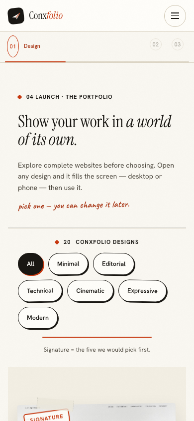
Think about how a portfolio link is actually received. It arrives in an email, a message or a profile. The person opening it is on a train, between meetings, or reading applications on a sofa. The wide layout that you spent the evening looking at is the version they are least likely to see.
What that changes
At narrow width the page becomes a single column, which means the order of your sections is the order they are read in, with no scanning sideways. The first entry gets more weight than it does at desktop width, and everything below the second screen gets less. A page that works at 390 pixels almost always works at 1440; the reverse is not true.
The three things that break
- Long entry titles. A project name that fits on one line in a wide column takes three on a narrow one, and three-line titles turn a list into a paragraph.
- Long tag lists. Tags are optional on an entry and they multiply. Six tags read as a keyword field at any width and as clutter at this one.
- Unbroken case-study text. A four-sentence paragraph is comfortable at desktop width and a wall on a phone. Breaking it into two is the whole repair.
All three are fixed in the details sheet rather than in a layout, which is the advantage of using a design somebody else authored: there is no width to adjust, only content to shorten.
Where to check
The step before publishing in the portfolio builder opens the real page over the builder with a desktop and a phone switch above it. That is the page itself rather than an image of it, so what you approve is what publishes. The gallery at step 01 has the same switch on each design's full-screen view, so you can look at a design at phone width before committing to it.
Both are worth two minutes. The narrow view is where an over-long page announces itself, and switching one entry off there often does more for the page than an hour of editing prose.
The first screen is the whole argument
On a phone, the first screen holds your name, your title and perhaps one entry. That is the part almost everybody sees and a large proportion of people see only. So the introduction has to be two or three sentences rather than a paragraph, and the first project has to be the strongest one.
This is the same discipline as keeping the number of projects small, arriving from a different direction. A shorter page is a better phone page, and a better phone page is a better page.
Images at narrow width
An image that carries a diagram or fine detail loses it on a phone. An image that carries a general impression survives. If a piece depends on detail, the entry's line has to carry the argument instead, because the picture will not. That is a reason to write the outcome line properly even for visual work.
Contact details, where a thumb can reach them
The contact section prints only the fields you fill, which keeps it short, and short is what you want at the bottom of a narrow page. An email address and one link is usually the whole of it. Anything longer is a form, and nobody fills in a form on a portfolio.
Then publish
Publishing opens over the page and asks for two things: an address, typed as lower-case letters, digits and dashes between 3 and 63 characters, and an email address that receives one code to prove the claim is yours. Until you press publish the page is private and noindexed, which the sheet states on itself.
After that the link is the thing people will open on a phone, which is where this started. The full walkthrough covers the three steps in order if you have not built the page yet.
How the link will be shared
Usually pasted into a message or an email, sometimes read aloud and typed by hand. Both of those are phone journeys, which is another reason the narrow page is the real one. A short address helps here as well, because a long one wraps in a message and becomes two lines that nobody clicks.
It is worth opening your own published link on your own phone once, from an email you send yourself, rather than only in the check step. That is the journey a reader takes, and it catches the last small things: a link that does not resolve, a section you forgot to switch off, an introduction that runs to six lines on a narrow screen when it read as three in the sheet.
That last one is the most common. An introduction is written into a wide field in the details sheet and read in a narrow column on a phone, and the two give very different impressions of the same three sentences. Cutting it to two is usually the repair, and it improves the desktop page as well.
Look at the narrow page before you publish
The step before publishing renders the real page at desktop and phone width, with a switch between them.
Open the portfolio builderSee the 20 designsQuestions
- Do I have to do anything to make it work on a phone
- No. Each of the 20 designs is authored at both widths, and the check step renders the real page at each of them so you can see it rather than assume it.
- What usually breaks at narrow width
- Long entry titles, long tag lists, and case-study paragraphs that become a wall. All three are content problems rather than layout problems, and all three are fixed in the details sheet.
- Can I choose a different design after seeing the phone view
- Yes, and it costs nothing. Switching design rewrites none of your entries.
- Is the gallery itself usable on a phone
- Yes. The picture above is the gallery at 390 pixels, and each design opens full screen at phone width with the same arrows as at desktop.
- Does the published page differ from the check step
- No. The check step renders the real page rather than a preview image, which is the reason it is worth looking at.
Conxfolio is a free set of four career tools: a résumé builder with 37 rendered layouts, an ATS résumé checker that prints its own arithmetic, a cover letter builder that traces every proof paragraph back to the line it came from, and a portfolio builder with 20 authored designs. There is no account to create, nothing is held back for a paid plan, and no language model is used anywhere in the product, so the readers, the score and the letter are deterministic code you can check.