The check step renders your real page at 1280 and at 390 before anything is public
Most people who open a portfolio link do it on a phone, from a message, standing up. That is the page you are really publishing.
— check the narrow one; it is the one they will see.
A portfolio is a link. Links travel in messages, and messages are read on phones, usually within a minute of being sent and usually while the reader is doing something else. The desktop layout you spent the evening on is the second impression.
So the third step of the portfolio builder renders the real page at both widths before anything is public.
What the step does
It loads your page, with your material in it, into a frame at the chosen device width and scales the frame to fit the stage. Desktop renders at 1280 and phone at 390, which means the page is genuinely laid out at those widths rather than shown small. A layout that breaks at 390 breaks here, in front of you, with a publish button sitting next to it.
What ours looked like
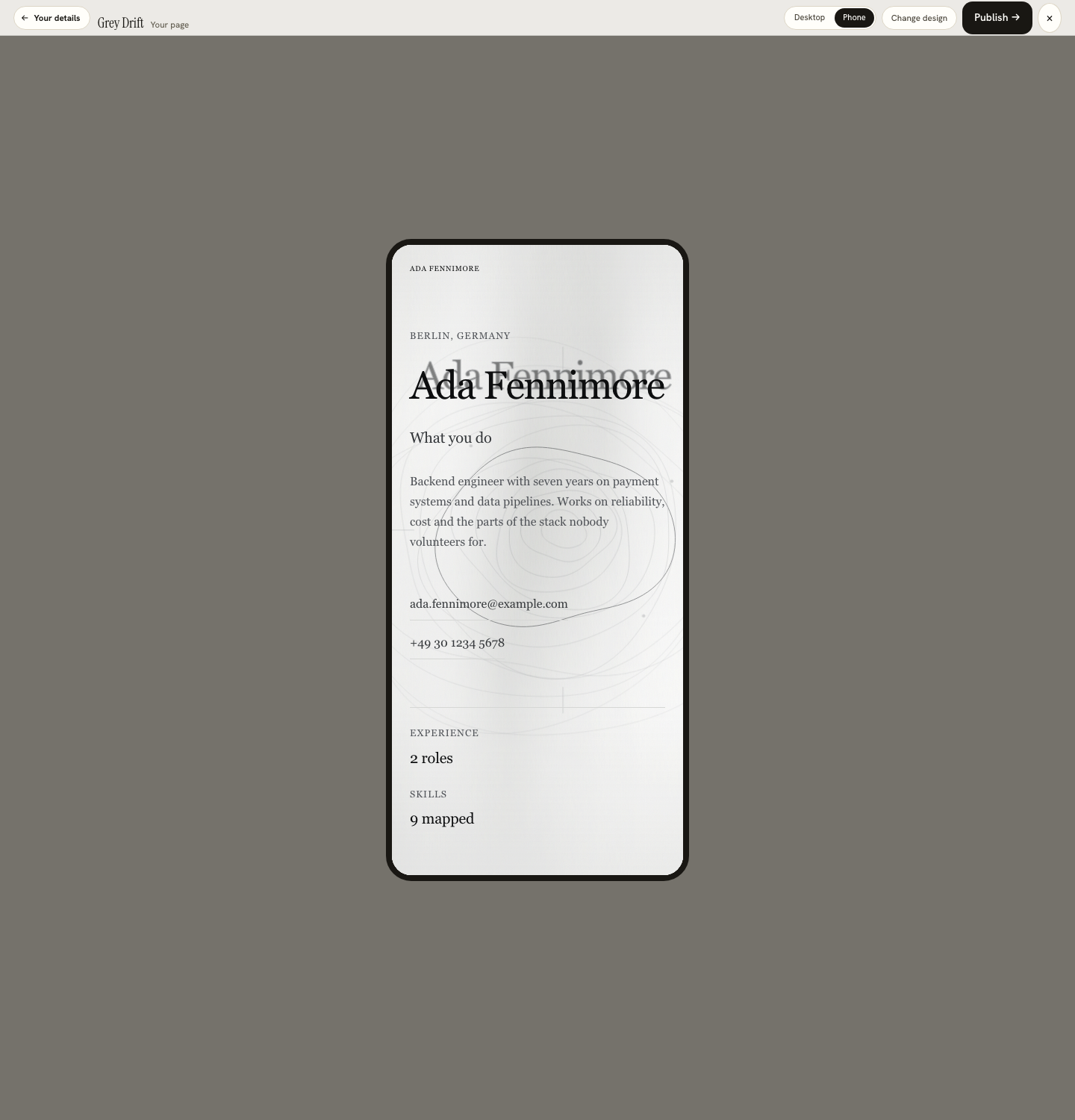
We built a page for Ada Fennimore, an invented backend engineer, on a minimal design, and switched to phone. The first screen carried her location, her name at display size, the line about what she does, her summary, both contact details, and then the counts: two roles, nine skills. Nothing had collapsed and nothing had been cut, because the design had been drawn for the narrow width as well as the wide one.
The three things that go wrong at 390
First, the opening screen loses its identity, because a design that put a name beside a portrait now puts the name under it and the portrait fills the fold. Second, a long project title wraps to three lines and pushes the year out of alignment. Third, an image that was a detail at 1280 becomes a grey band at 390. All three are visible in ten seconds at the page step, and none of them is visible anywhere else.
What to do about each
Shorten the title rather than the design. Put the sentence that says what you do above the fold by editing it in the details step, where everything on the page comes from your own résumé. And for an image that has stopped working, either replace it or switch the entry's image off, which is a control on the entry rather than a change to the design.
The publish step is next, and it is not automatic
Publishing claims an address, and claiming one sends a one-time code to an email address so the address can be yours. It is the only place in the product that asks for an email, and a published page can be taken down again. That check-then-publish order is deliberate: nothing goes out on the strength of a desktop preview.
The fix is usually one step back
Almost everything that goes wrong at 390 is fixed in the details step rather than by changing the design. That step is where the page's material lives: the name, the title, the introduction, availability, location, then the projects and roles with a switch on each and a Details panel under it. The copy on it is explicit about where the content came from and what it is not: everything below came from your résumé, and nothing here is invented.
So a title that wraps badly is shortened there. A project that adds nothing at narrow width is switched off there. An introduction that pushes the contact details below the fold is cut there, in the place where the words live, and the page step is one click away for the re-check. Two passes of that loop is usually the whole job.
What the render cannot tell you
How the page feels on a three-year-old handset on a train, which is the real test and which no frame reproduces. Open the published link on your own phone once, from a message, the way your reader will. The motion you will see there is the subject of motion that belongs to the content, and the reason the page looks like its poster is in the poster and the page agree.
See your page at both widths
The page step carries a Desktop and Phone switch. Both render the real page with your own material before anything is published.
Open the portfolio builderBrowse the portfolio designsQuestions
- What widths are used
- 1280 for desktop and 390 for phone. The page is rendered at that width and scaled to fit the stage, so the layout you see is the layout at that size rather than a squeezed version of a wider one.
- Is this a real render or a preview image
- A real render of your page, in a frame, using the same renderer that serves the published page.
- Where is this in the journey
- The third step. Design, then your details, then your page, where the render and the publish button sit together.
- Why does the phone view matter more
- Because a portfolio link is usually opened from a message on a phone. The desktop view is the one you design for and the phone view is the one that gets seen.
- What should I look for at 390
- Whether the first screen still says who you are and what you do, whether any project title wraps badly, and whether an image has become a grey band. Those are the three failures that show up at narrow widths.
Conxfolio is a free set of four career tools: a résumé builder with 37 rendered layouts, an ATS résumé checker that prints its own arithmetic, a cover letter builder that traces every proof paragraph back to the line it came from, and a portfolio builder with 20 authored designs. There is no account to create, nothing is held back for a paid plan, and no language model is used anywhere in the product, so the readers, the score and the letter are deterministic code you can check.