A UX designer résumé example, with research on the page
One complete UX designer résumé, written out in full. The person is invented. The reading and the score come from the product itself.
— how many people did you talk to. that is the question.
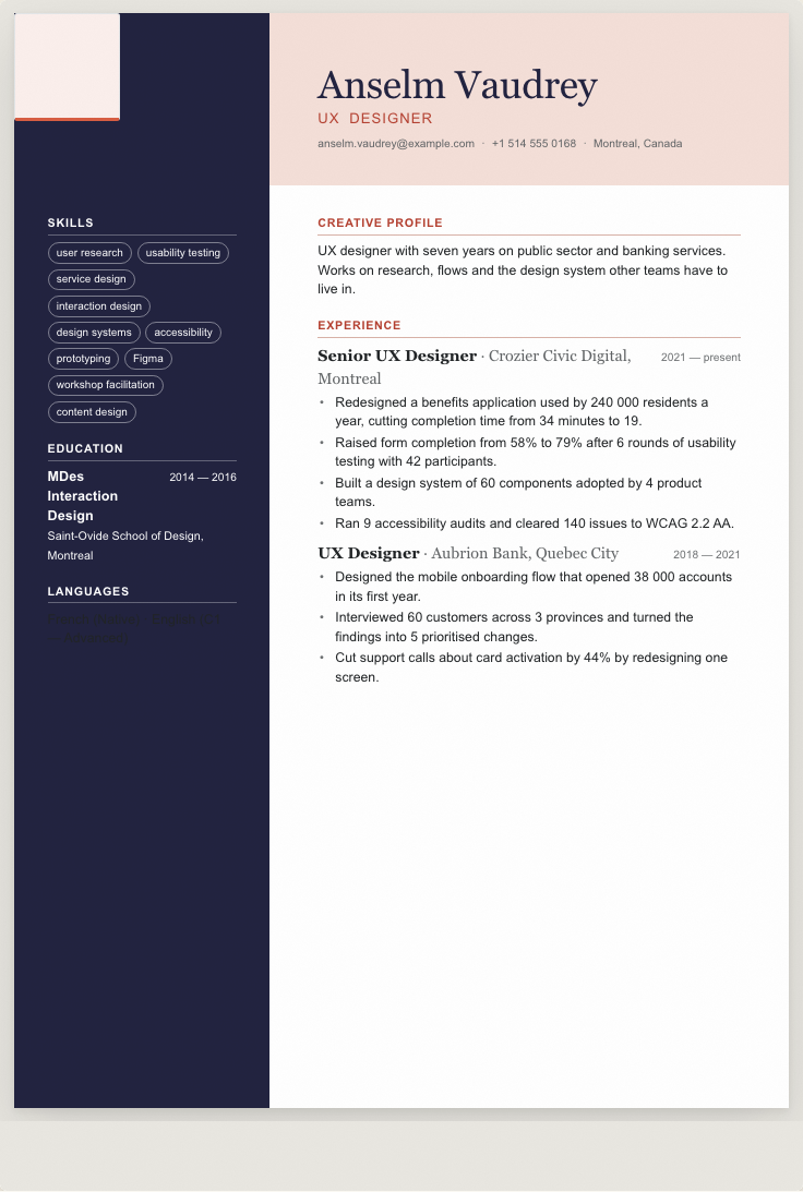
A UX designer's résumé has to survive two readers with opposite habits: a hiring manager who will judge it as a designed artefact, and a parser that sees only text. This example is written out in full so you can read the lines, then put through the tools here so you can see what the second reader finds. The candidate is invented. Anselm Vaudrey does not exist, neither employer exists, and every figure was chosen to demonstrate a shape.
The example, in full
An invented person. Not a real document, and not yours.
Anselm Vaudrey
UX Designer
Montreal, Canada · [email protected] · +1 514 555 0168
Summary
UX designer with seven years on public sector and banking services. Works on research, flows and the design system other teams have to live in.
Experience
Senior UX Designer · Crozier Civic Digital, Montreal · 2021 to present
- Redesigned a benefits application used by 240 000 residents a year, cutting completion time from 34 minutes to 19.
- Raised form completion from 58% to 79% after 6 rounds of usability testing with 42 participants.
- Built a design system of 60 components adopted by 4 product teams.
- Ran 9 accessibility audits and cleared 140 issues to WCAG 2.2 AA.
UX Designer · Aubrion Bank, Quebec City · 2018 to 2021
- Designed the mobile onboarding flow that opened 38 000 accounts in its first year.
- Interviewed 60 customers across 3 provinces and turned the findings into 5 prioritised changes.
- Cut support calls about card activation by 44% by redesigning one screen.
Education
MDes Interaction Design · Saint-Ovide School of Design, Montreal · 2014 to 2016
Skills
user research, usability testing, service design, interaction design, design systems, accessibility, prototyping, Figma, workshop facilitation, content design
Languages
French · native · English · C1
Research is the part that is hardest to fake
Sixty customers interviewed across three provinces. Forty-two participants over six rounds of usability testing. Nine accessibility audits with 140 issues cleared. Those are the lines a design lead reads first, because they are countable and because the number of people a designer has actually spoken to is the most reliable proxy for how they work.
The outcomes sit beside them. Completion time from 34 minutes to 19 on a benefits application used by 240 000 residents a year. Form completion from 58% to 79%. Support calls about card activation down 44% after one screen was redesigned. That last one is the most useful shape on the page: a small change, a measured effect.
The design system line is the seniority line
Sixty components adopted by four product teams is a statement about influence rather than craft, and it is what separates a senior designer from a good one. Adoption is the measurable part. A component library nobody uses is a portfolio piece.
The portfolio address sits in the contact row as plain text, which is the only form that survives extraction. The guide on linking a portfolio covers the placement, and the portfolio builder here makes a page from the same material if you want one.
What the reading found
The door below hands this document to the résumé builder as plain text, through the same import an uploaded file goes through, and the review shows each field beside the line it came from. Here the completeness pass found four readable sections, 118 words of experience evidence and ten distinct skills, with the portfolio address kept in the contact row.
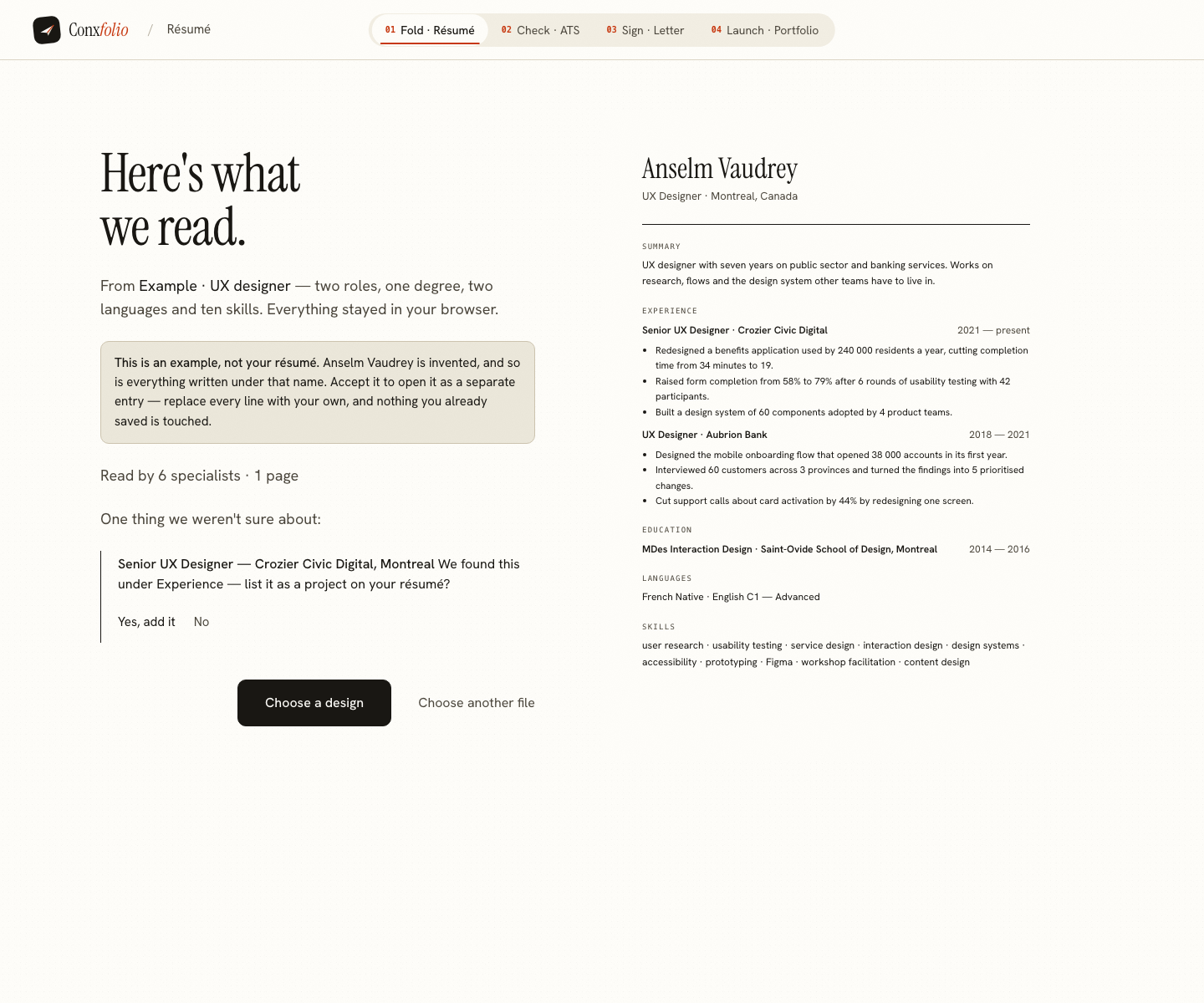
Nothing in that reading uses a language model. Every string a reader emits is checked in code to be a span of the source, so a research figure cannot be rounded and a client cannot be renamed.
What the checker scored it
Ninety-seven out of 100, with one improvement remaining worth 8 points. The arithmetic is 100 × 30% + 100 × 30% + 92 × 40% = 97, set out in the article on the score. Seven action-led lines, four measurable, seven lines of depth and 192 readable words against a band opening at 250.
Studio is one of the layouts not marked ATS-safe, and the score above is measured on this document's text rather than on the exported Studio page, so it proves nothing about the layout. The mark warns about a class of extraction risk; the way to test it is to export the PDF and put the export through the ATS checker. For a design studio, send the page you would defend. For a bank's application portal, use one of the 21 ATS-safe layouts and let the portfolio carry the aesthetics.
What this example leaves off
No skill bars, no tool proficiency percentages and no personality graphic. A design lead reads those as decoration, and a parser reads them as nothing at all, so they cost space in both directions.
Project titles without outcomes are left off too. A list of six product names tells a reader where you worked, which the employer line already said. The participant counts, completion rates and adoption figures are the part that describes the designer rather than the company.
What to change for your own
Change the domain and the constraint. Public services, regulated finance, retail and internal tools all use this shape and differ in what they are allowed to test. Then put your own participant counts, rounds, adoption figures and completion rates in.
Keep the accessibility line if you have one. Keep the portfolio address readable. The design gallery holds 37 layouts, and the graphic designer example, the data engineer example and the DevOps example show the same structure in neighbouring work.
Write yours beside it
Opens the builder with Anselm's example loaded, saved as its own entry in the Studio design. Replace every line with your own. Free, no account.
Use this exampleCheck a résumé insteadQuestions
- Is Anselm Vaudrey a real designer
- No. He is invented for this page, and so are Crozier Civic Digital and Aubrion Bank. Every figure was written to show a shape and describes nobody.
- Does the portfolio replace the résumé
- No. The portfolio decides the hire and the résumé decides whether the portfolio gets opened. The example puts the address in the contact row as plain text so it survives extraction.
- How much research detail belongs on the page
- Participants, rounds and what changed. Forty-two participants over six rounds, leading to form completion moving from 58% to 79%, is a research practice described in one sentence.
- What did the checker score it
- 97 out of 100, with one improvement remaining worth 8 points. The document has 192 readable words and the volume rule's top band opens at 250. Two roles in seven years is a short page.
- Is accessibility work worth listing separately
- On service work it is one of the first things a hiring manager checks. Nine audits and 140 issues cleared to a named standard is a fact, and it is more useful than adding accessibility to a skills row.
- Which design is this rendered in
- Studio, one of the 37 layouts and not one of the 21 marked ATS-safe. The section below explains why that is a reasonable trade for a designer and where it is not.
Conxfolio is a free set of four career tools: a résumé builder with 37 rendered layouts, an ATS résumé checker that prints its own arithmetic, a cover letter builder that traces every proof paragraph back to the line it came from, and a portfolio builder with 20 authored designs. There is no account to create, nothing is held back for a paid plan, and no language model is used anywhere in the product, so the readers, the score and the letter are deterministic code you can check.